"Fannie Mae reported that the serious delinquency rate decreased to 4.14% in May, down from 4.19% in April. This is down from 5.15% in May 2010. The Fannie Mae serious delinquency rate peaked in February 2010 at 5.59%."
Thursday, June 30, 2011


Interest Rates Moving Higher
Interest Rates are moving higher this morning, most likely in response to three items:
1) Chicago Purchasing Managers Index (PMI) surprising to the upside link
Index (SA): Jan '11: 68.8 Feb '11: 71.2 Mar '11: 70.6 Apr '11: 67.6 May '11: 56.6 Jun '11: 61.1
2) KC Fed Manufacturing Survey posted a rebound link
3) End of QE2
All in all, a terrible 4 days for interest rates as the Treasury's 10 Yr Bond index has jumped from a low of 2.84% last Friday to today's current yield of 3.15%, a 31 bps jump in yield.
Technically, the Rsi is still rising at 59.13. Based on the internal Rsi construction, we should expect interest rates to continue to rise, albeit I would expect more modestly moving forward, through the first half of July before we would look to re-assess the interest rate outlook on a technical basis.

1) Chicago Purchasing Managers Index (PMI) surprising to the upside link
Index (SA): Jan '11: 68.8 Feb '11: 71.2 Mar '11: 70.6 Apr '11: 67.6 May '11: 56.6 Jun '11: 61.1
2) KC Fed Manufacturing Survey posted a rebound link
3) End of QE2
All in all, a terrible 4 days for interest rates as the Treasury's 10 Yr Bond index has jumped from a low of 2.84% last Friday to today's current yield of 3.15%, a 31 bps jump in yield.
Technically, the Rsi is still rising at 59.13. Based on the internal Rsi construction, we should expect interest rates to continue to rise, albeit I would expect more modestly moving forward, through the first half of July before we would look to re-assess the interest rate outlook on a technical basis.

Tuesday, June 21, 2011
Employment For Last Four Recoveries

Using the Household Survey of Total Civilian Employment.
Link: http://research.stlouisfed.org/fred2/series/CE16OV/downloaddata?cid=12
I've set the baseline as the official month of recovery established by the NBER. The most recent monthly data currently gives us 23 months since the recovery began. Here are the cumulative employment gains (losses) at the 23 month mark for the 1982 Recovery, the 1991 Recovery, the 2001 Recovery, and the 2009 Recovery, as reported by the BLS Household Survey:
1982 Recovery: 6,526,000
1991 Recovery: 1,623,000
2001 Recovery: 1,746,000
2009 Recovery: -199,000
Now, let's take this one small step further...we have the cumulative totals for the first 23 months above, but let's then look at the 24th month in isolation, and compare it with the most recent month's data for this recovery:
1982 Recovery 24th month: +334,000
1991 Recovery 24th month: +267,000
2001 Recovery 24th month: +440,000
2009 Recovery 23rd month (latest data): +105,000
Tuesday, June 14, 2011
Technical Snapshot: 10 Yr Treasury Index

A very brief technical snapshot of the 10 yr Treasury index.
Technical Picture: 10 Yr Treasury Index
Comments: June 9, 2011 low in interest rates was accompanied by a momentum divergence in the rsi (higher momentum low with lower price low) indicating at least a short term bottoming pattern in interest rates. Assuming that the market is now in a counter-trend rally from the April 8 short term high in interest rates…200 day Moving Average at 3.10%...50 day Moving Average at 3.23%...basically looking for a very modest increase in rates through the end of June, with the obvious targets in the 3.23% range.
Profile of March 16 to April 8 increase in interest rates
Low in rate: 3.14%
High in rate: 3.62%
Increase of 48 bps
Total number of trading days: 17
Current Profile:
Low in rate: 2.91%
Date of low in rate: June 9, 2011
17 days from June 9: July 5
Thursday, May 26, 2011
Q1 GDP Revision; Jobless Claims
From the BEA: Gross Domestic Product, First Quarter 2011 (second estimate)
Today's GDP Revision came in at an unchanged 1.8% annualized rate.
Initial jobless claims moved higher to 424,000. Link here.
Today's GDP Revision came in at an unchanged 1.8% annualized rate.
Initial jobless claims moved higher to 424,000. Link here.
Tuesday, May 3, 2011
Comparison of Last Four Economic Recoveries
I've put together a comparison, on a cumulative basis in percentage terms, of the last four economic recoveries.

Raw Percentage Numbers from Excel Spreadsheet:
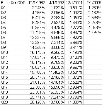
Currently, the 2009 recovery is doing slightly better than the 2002 recovery, although the difference is more than entirely due to the inventory rebuild experienced in the current recovery.
Cumulative Inventory Gains 2009 Recovery vs 2002 Recovery, as a cumulative percentage to GDP, after 7 quarters:
2002: 3.51%
2009: 6.51%
2002: 3.51%
2009: 6.51%
Comparison of Economic Recoveries - Chart

Tuesday, April 19, 2011
When Will Fed-Created Melt-Up Turn Into a Meltdown?
A thought provoking article by Russ Winter at Minyanville.

link
The following chart says it all. The Fed’s aggressive Treasury monetization has been the causa proxima (90-percent correlation) to the peddle-to-the-metal Minsky Meltup in commodities. I suspected this would be the effect but confess I did not believe the Fed and government could be so irrational as to attempt it, especially with the blowback evident by year end. Though I am one of the most persistent critics of the Fed, this exceeded even my worst fears. This is what Bernanke refers to as “temporary” inflation. Nor did I anticipate the markets ignoring such clear and present danger. The transmission of this inflation disease appears to take about six months, which corresponds to the MIT price survey I have been using. It, too, now shows that inflation is in full swing.
The question now: When does the meltup switch into a full-fledged meltdown of the global economy? In spite of all warning signs that the Fed has ignored over the past few months, the switchover is now transmitting at such a rapid pace that it could happen in either one great shock or in a series. In my view, the 320 level on the CRB was more than enough to trigger the switch, and it corresponds with the first riots in Tunisia and then Egypt. If the Fed continues its purchases, we can calculate that each new $100 billion of Treasury purchased will add about 5 percent to the commodity index and $7 to oil. It takes four weeks for the Fed to purchase $100 billion in Treasuries. What a game of chicken being played out and right before our eyes! You can sense the collision, flying glass, blood, and bones at almost any moment. If the Fed desists or scales down its Treasury buying, the stark trillion dollar question becomes who will buy them?

link
The following chart says it all. The Fed’s aggressive Treasury monetization has been the causa proxima (90-percent correlation) to the peddle-to-the-metal Minsky Meltup in commodities. I suspected this would be the effect but confess I did not believe the Fed and government could be so irrational as to attempt it, especially with the blowback evident by year end. Though I am one of the most persistent critics of the Fed, this exceeded even my worst fears. This is what Bernanke refers to as “temporary” inflation. Nor did I anticipate the markets ignoring such clear and present danger. The transmission of this inflation disease appears to take about six months, which corresponds to the MIT price survey I have been using. It, too, now shows that inflation is in full swing.
The question now: When does the meltup switch into a full-fledged meltdown of the global economy? In spite of all warning signs that the Fed has ignored over the past few months, the switchover is now transmitting at such a rapid pace that it could happen in either one great shock or in a series. In my view, the 320 level on the CRB was more than enough to trigger the switch, and it corresponds with the first riots in Tunisia and then Egypt. If the Fed continues its purchases, we can calculate that each new $100 billion of Treasury purchased will add about 5 percent to the commodity index and $7 to oil. It takes four weeks for the Fed to purchase $100 billion in Treasuries. What a game of chicken being played out and right before our eyes! You can sense the collision, flying glass, blood, and bones at almost any moment. If the Fed desists or scales down its Treasury buying, the stark trillion dollar question becomes who will buy them?

Subscribe to:
Posts (Atom)

